“Inky Fingers” Technique Blog Hop
Welcome to our Technique Blog Hop! This month we are highlighting INKS today. This blog hop is a great big circle so you can start wherever you want and continue through to see all the fabulous artwork incorporating this technique. If you are coming from Darlys Recker’s Blog, you are on the right track!
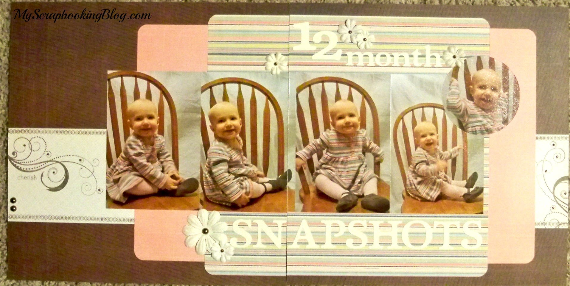
I haven’t played with the Distress Oxide Inks a ton yet but I love them! On this first layout, I love the rainbow look with the blending of these inks and thought it would be perfect for a school layout. TIP: Only ink/blend where you will see. Or, you could cut out the middle and use it for another project! I thought of that after the fact so please learn from my mistake. 🙂
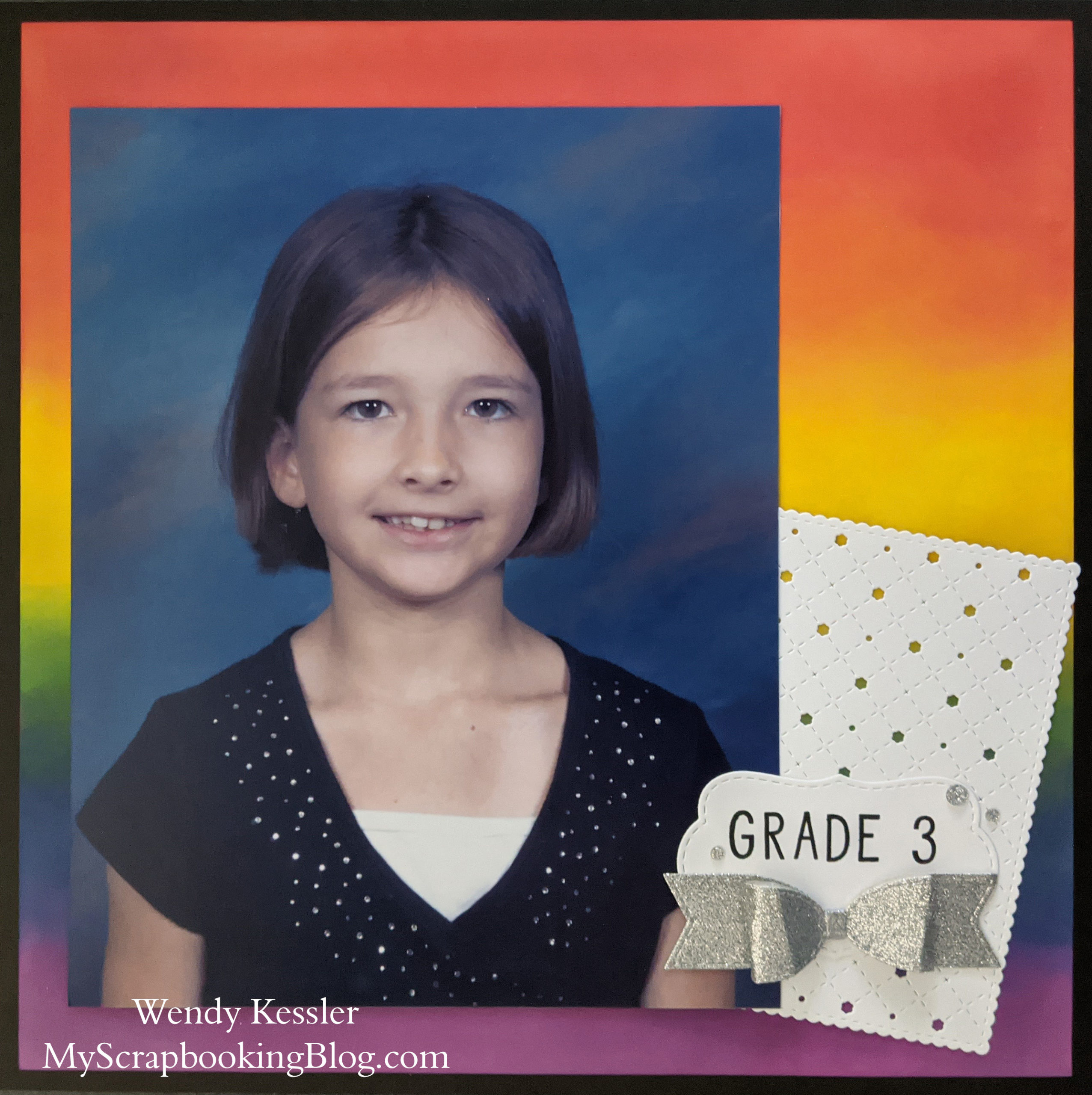
Supplies used are all Close to My Heart: Distress Oxide Inks (Candied Apple, Mustard Seed, Mowed Lawn, Chipped Sapphire, Seedless Preserves), Mini Ink Blending Tool, Black Cardstock, White Daisy Cardstock, Stitched Lattice Background Thin Cuts, Small Bow Thin Cuts, Silver Glitter Paper, Stitched Scalloped Bracket Thin Cuts, Black Ink, Simply Said Alphabet stamp set, and Silver Glitter Gems.
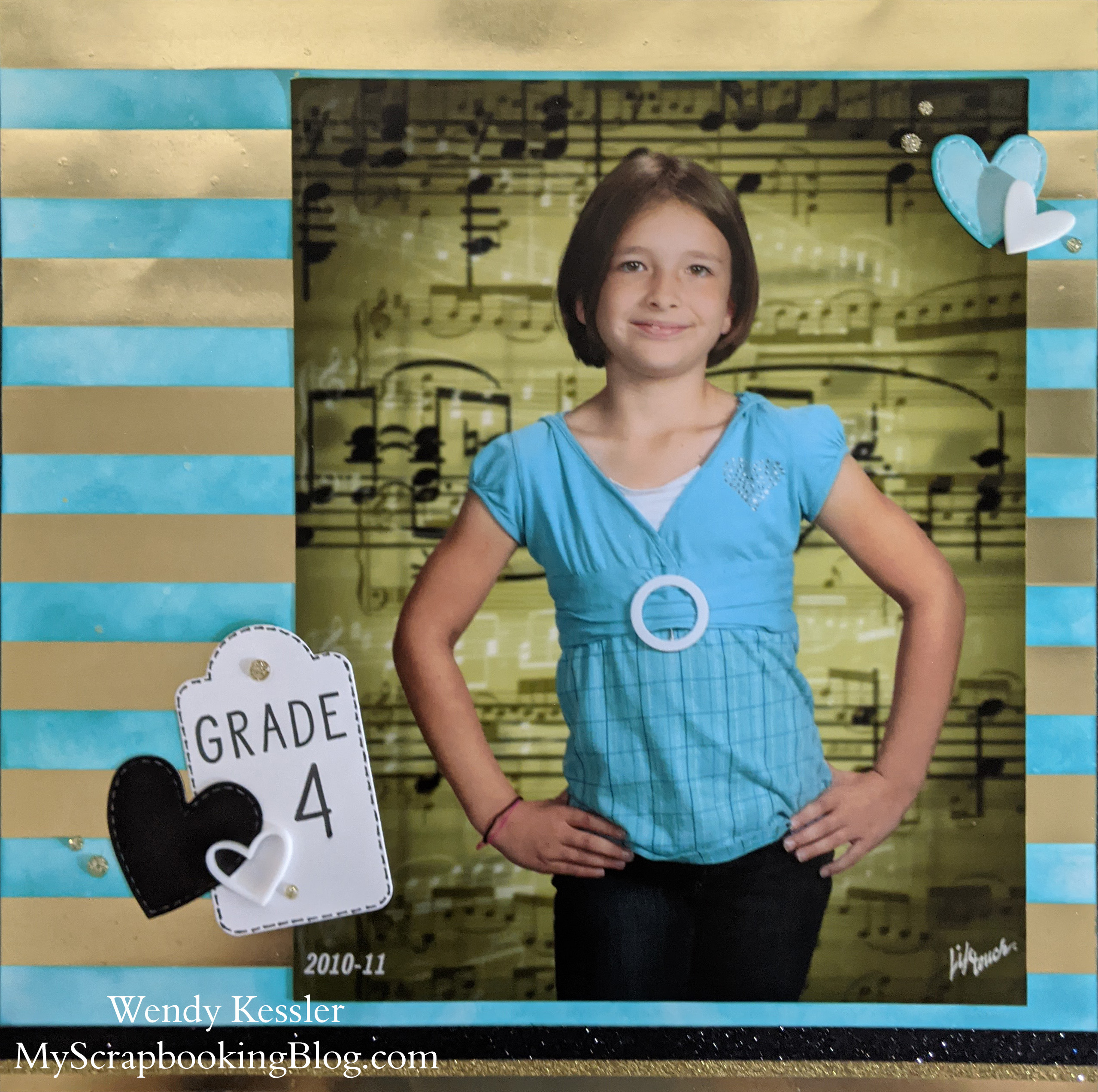
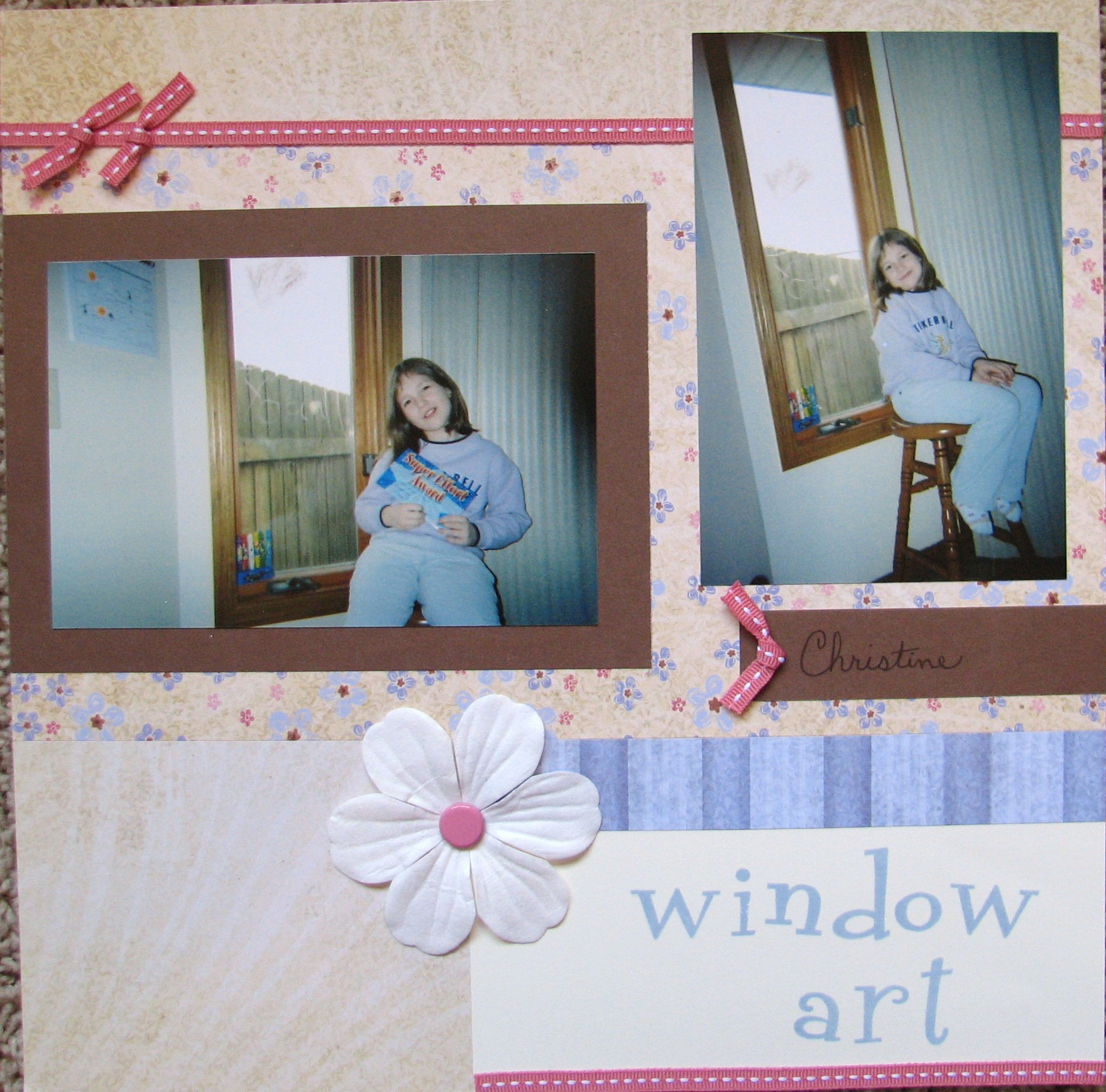
Supplies are all Close to My Heart: Gold Foils Patterned Paper Packet, Peacock Feathers Distress Oxide Ink, Mini Ink Blending Tool, Gold Shimmer Brush, Gold Shimmer Trim, Black Shimmer Trim, Stitched Heart Thin Cuts, Tags & Tabs Thin Cuts, Simply Said Alphabet stamp set, Erin’s Hand Alphabet stamp set, Black Ink, Acrylic Hearts, and Gold Glitter Gems.
On this second layout, I really wanted to use the Peacock Feathers color but I was really unsure how the Distress Oxide Ink would work on the foil paper and you just don’t know until you try!
TIPS:
*Do not try to cover the foil with washi tape because it will remove some of the foil. Hence, the addition of glitter trim on the bottom. 🙂
*I tried to “remove” the Distress Ink from the foil with a baby wipe. This left a “gritty” feel to the foil.
*Wiping the ink off with water and a tissue seemed to work best. I wiped along with the lines so it would still look ok if any ink was left behind.
*You could also leave the ink on. It gives the foil a “muted” or “foggy” look and I would just use your sponge to even it out in straight swipes along the lines so it doesn’t show the circular movements of your blending.
*You can always safely test on a portion of your paper that you plan to cover up.
Thanks for stopping by! Please continue onto Michelle Johns’ Blog where you will find some additional artwork highlighting this technique! Be sure to leave a comment and let me know what you thought of my variation and happy hopping!

Love your layouts. Great tips, too!
Fabulous backgrounds, I love how you added the blue to the white and gold striped paper to match your photos, it is fabulous!
How great are these layouts! I love them!
What awesome layouts to immortalize your sweet girl!