CTMH Spotlight Blog Hop – Art Philosophy
Welcome to the September 2011 Close to My Heart Spotlight Blog Hop! This month we are all using the new Art Philosophy Cricut Collection!  This blog hop is a circle so if you are just starting, continue until you make your way back here.  If you are coming from Tamytha’s Blog, you are on the right track!
The Art Philosophy Cricut Collection includes: 1 – Cartridge (700 images, font, shapes, and 3-D items), 3 – My Acrylix D-size Stamp Sets, and 3 – 9×12 Dimensional Elements (3 sheets of different shapes) all for the great price of only $99.00 (a retail value of $124.69).  This is such a great price as well as a great package.  I am loving all the images on the cartridge.  It has become a permanent cartridge in my machine.
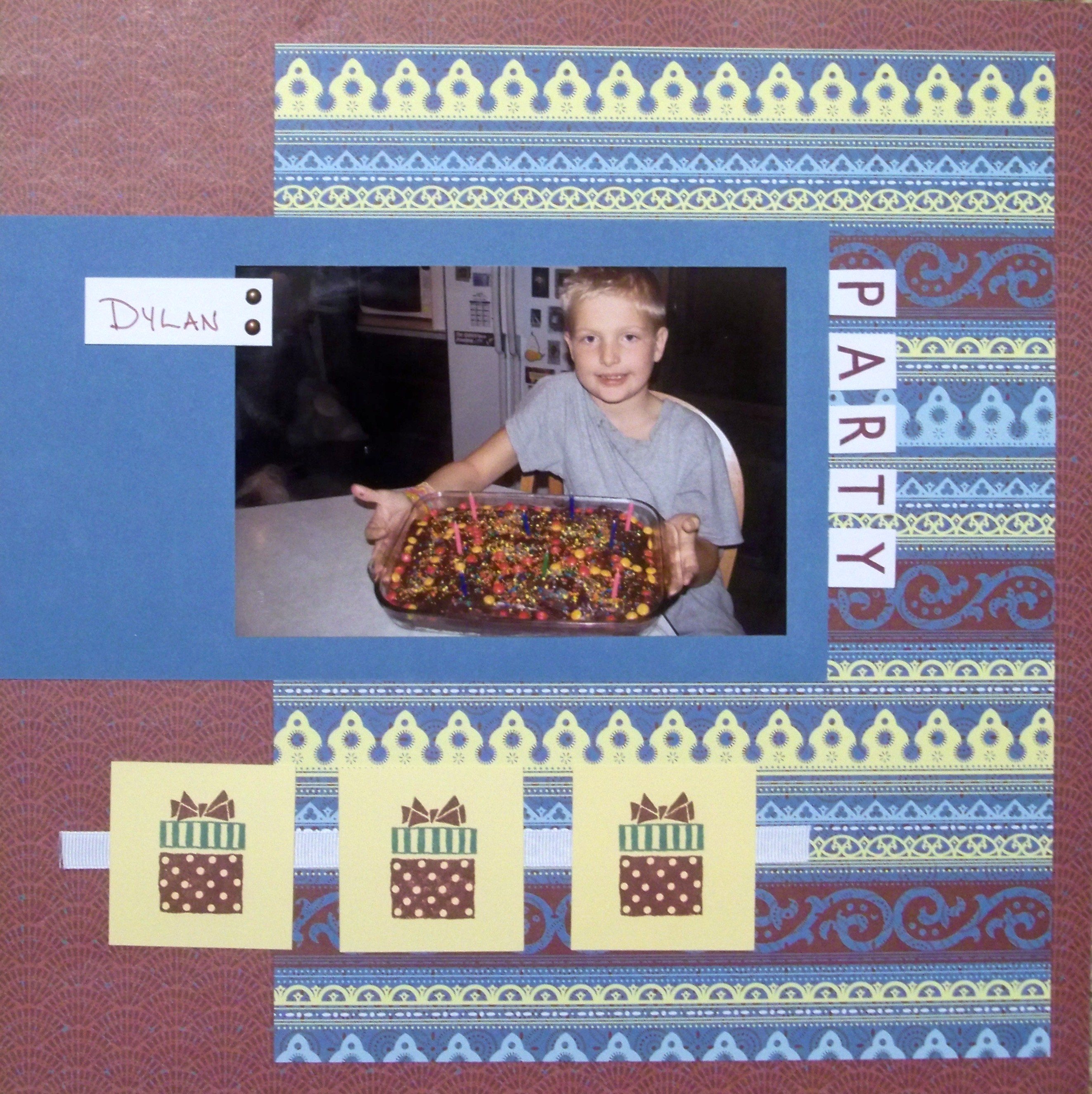
As much as I love the 3-D options this cartridge provides, I thought I would focus more on the use of the entire collection together.  I’m sure you will see many 3-D items throughout the swap.  So for you today I have created the same layout twice, one using the Cricut Collection and one without.  I used the Main Frame – Charmed pattern out of the Reflections book.
And here’s my layout using the cartridge, stamps, and Dimensional Elements in the Art Philosophy Cricut Collection:
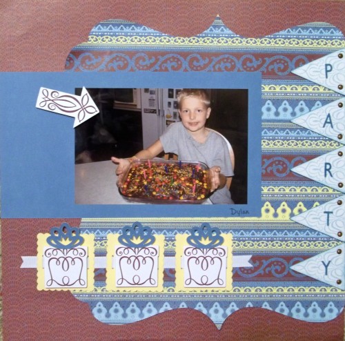
Supplies used: Art Philosophy Cricut Collection, Reflections, Sweet Home Paper Pack, White Daisy Grosgrain Ribbon, Pennant Alphabet, Antiqued Copper Brads, Indian Corn Blue ink, and Garnet Ink.
Thanks for stopping by!  Your next stop is My Creative Ink!
For a list of all the blog hop participants, scroll down to the previous post.

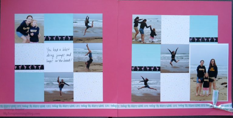
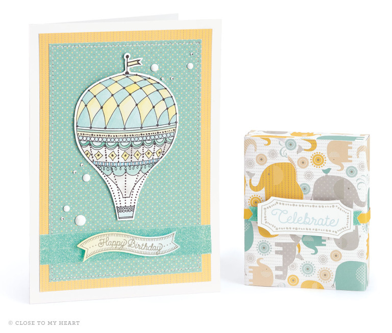
I love what a change the Cricut cuts made – TFS!
love how you did the amped version to show how easy it is. love it
What a great way to dress-up a layout! TFS
I love how you compared both layouts. Same paper and design, but WOW what a difference.
Hi Wendy, I love the sideways banner!
So, I posted my comment on the wrong post! 🙂 I really like both layouts, but the Cricut one is especially fun!
Absolutely fantastic way of showing how dramatically the Cricut shapes can dress up the look of a layout. Awesome job!